Showing posts with label design. Show all posts

Thursday, April 10, 2008

i be edumacated

I just got this in the mail:

diploma

This is the most expensive piece of paper I have ever owned.

Monday, April 7, 2008

WIWOT*

Often when I get together with other designers, we'll ask each other what projects we're working on. Right now I'm working on a project that I think even the non-designers will be interested in...I am designing the coffee table book for the new California Academy of Sciences building in Golden Gate Park, designed by Renzo Piano (who designed the Pompidou in Paris). The building opens in September of this year and will be directly across from the new de Young museum. It is a dream project and I am so, so, SO excited to be working on it. Since I think the studio signed an NDA or something with the Academy, I can't realy give away any details, but I can repost what has already been revealed on the web. First of all, a model of the building, from bird's-eye view:


And that's pretty much what it looks like from the top. BTW, that's a living roof, made up of over 20 million plants. There was the problem of figuring out how to plant stuff on a sloping surface, so they came up with these trays made of coconut husks and tree sap. Once the plants started to root, the trays were locked together and they will eventually biodegrade. Here's a current view of the roof:


And here is what it looks like from inside the building:


The building is entirely green and energy efficient. Most of the focus right now is on the roof, but the details within the building are quite impressive as well. There are tons more details that I omitting here cuz I don't want to get in trouble. It will definitely be worth visiting when the museum finally opens!

* WIWOT = What I'm Working On Today. I send an email to Cinthia everyday with this subject line, just so we can keep in the loop. She thinks the acronym is hilarious for some reason...

Friday, March 14, 2008

Date Night

One of J and I's Chinese New Year's resolutions (We were a little late getting started on the resolutions and just decided we would make them CHINESE new year's resolutions so we wouldn't feel so bad being slackers. See, it pays to be Chinese!!!) was to reinstate date night. And we've been pretty good at keeping this resolution! However, after an inspiring conversation with K, we decided that we needed to come up with some dates that didn't revolve entirely around eating and drinking.

A couple of weeks ago, we caught the Olafur Eliasson show at the SFMOMA. WOW! I was very impressed...his work seemed to me all about making us more aware of our environment; in specific, those elements that you don't really pay that much attention to, like the nature of light in a room, or the way the air moves around a space. Our favorite was this piece:


The room was a seamless circle that seemed to glow from the walls, and the color would transition ever so slightly every few minutes. When we walked in, the room was bright white and everyone was chattering away. About two minutes late, the light completely dimmed and all of a sudden everyone became completely quiet. Now that's a successful piece! I love how interactive the show was and I was happy to see the MOMA move towards the contemporary.

A week later, we went and saw the Magnetic Fields (as I mentioned in a previous post), which was a super fun show.

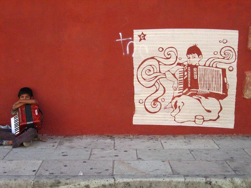
Date night this week involved the opening night the SF International Asian American Film Festival. This was extra fun for me because the Center for Asian American Media is one of 
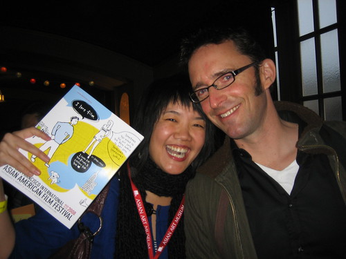
Noon's clients and we did all the design for the event, from the trailer to the catalog to the t-shirts to the website. I really like the festival campaign this year, it is very different from Noon's typical super-clean, super-refined look and everyone worked together to make it gel. The concept was "conversations," and Leah did all original illustrations for the campaign. One of the characters is based on me (with long hair)! Here I am holding up the 108-page catalog I designed, the character based on me is the gal with the striped tunic on in the upper right hand corner of the catalog cover:

IMG_9772

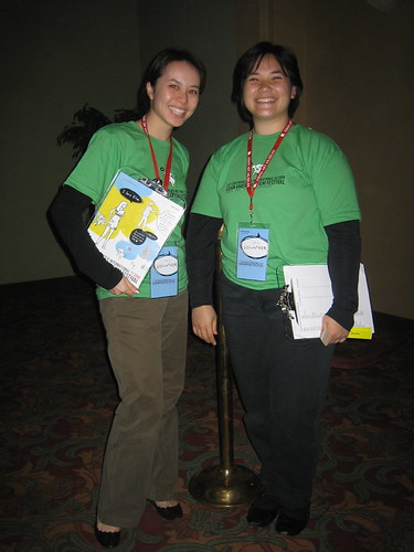
I also designed the t-shirts and badges, shown on some volunteers here:

IMG_9769

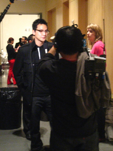
The film was "A Thousand years of Good Prayers" by Wayne Wang (director of The Joy Luck Club), and it was a sweet little film about an estranged father and daughter. Wayne was at the opening night gala:

Wayne Wang

As was henry O, who acted in the film. Here is Do Young getting his autograph. So cute!

Henry O

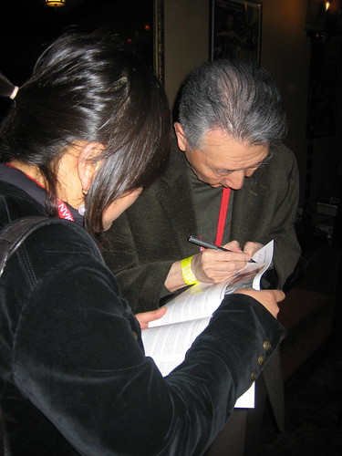
Hong Kong actor Daniel Wu was also there, though I don't know who he is. Tomo was quite excited to see him in person, though!

daniel wu

Next week date night just involves dinner plans, but we deserve it! :)

Monday, December 10, 2007

Eye Candy

Leah, one of the gals I work with at Noon, went to the EG conference and she loved it! Apparently it's kind of like the TED conference, where the greatest minds in the world come together and, uh, confer. Actually, after hearing about all the cool people and awesome stuff she did at the conference, I was kinda jeal that I didn't get to go!


One of the speakers that she told us about was the guy who put together this website: http://www.wefeelfine.org/. Basically, this website searches the entire Interweb for the phrases "I feel" and "I am feeling" and records the sentence that this phrase is found in. It them compiles data on the writer of the phrase and organizes that info in a number of ways, all of which look effin' cool!


This is a truly excellent example of gorgeous and well-communicated information design.

Click here to open up the site. I promise you won't be sorry. It's gorgeous!

Friday, November 23, 2007

Inspiration

I absolutely love my job as a graphic designer...sometimes as I'm sketching ideas for a new logo or poster, I pinch myself because my job is just. so. COOL! I truly feel like one of the lucky and privileged because my work doesn't feel like work.

But just because I love my job doesn't mean I don't have bad days...sometimes I just don't feel creative, or I am feeling drained, or I don't want to work on a particular project...any number of things can happen which cause me to feel like the inspiration well has dried up. In moments like these, I've learned that it's a good idea to turn to books, magazines, websites...any sort of visual stimulation that will get the ideas flowing. In the past few weeks, I've run across two designers, both women, both extraordinary. Check it out...you won't be sorry.

First off, Tauba Auerbach. I have to warn you that her website is kinda...harsh on the eyes. But click through to her work: http://www.taubaauerbach.com/works.html. Maybe it's because I am a type nerd, but her work is just so lovely to me. Most of it is ink or pencil on paper, and in some way relates to type. I mean, how can you not love this, her study of the letter K:


Or this, which is the entire alphabet, broken down into strokes:


Or this piece, which is composed of 10,000 pieces of cut letters on paper:


I mean, WOW.

Courtney Skott is a furniture designer; she actually went to my school and I first encountered her work when she won the annual Ronald & Anita Wornick award (a scholarship that is awarded to two student furniture designers every year). The following piece is one of those things you just never forget once you see it:


Yeah, that's right...they are little tree stools with zip-up bark jackets. Brilliant!!!

I also really love this piece, her thesis project. It is an alcove bed and the pattern is a pixelated image of clouds.


It is absolutely insane how she made this...you can see a step-by-step of her process on her Flickr set.

Check out some more of her work here: http://courtneyskott.com

Thanks for the inspiration, ladies!

Saturday, August 4, 2007

Personal Work

Fantasmas Final

I've finished my personal work, letterforms that I found in the covered up graffiti in Oaxaca. Some of the local students that are working with our class said they really liked my piece, because (intentionally or unintentionally), there is a political component to it (most of the graffiti is political in nature, and therefore covered up by the powers that be).

IMG_9072.JPG

I also wanted to share Tomo's personal work. There is a little boy who plays the accordion (and begs for money) right in front of Santo Domingo church, in the same place every day. In the middle of the night, Tomo went out and did this tape painting on the wall, right where the boy sits. That's right...he put up long strips of masking tape and cut the image out, then peeled it off. Everyone has been walking by taking pictures of it and I think the little boy has made out like a bandit. :)